1. Introduction — Why Trend Colors Matter More Than Most Contractors Think
In the past ten years, I’ve seen a clear shift in how color decisions are made in commercial painting projects. Color is no longer just a final decorative choice. For many retail brands, hospitality groups, and commercial developers, it has become part of their brand identity and marketing strategy.
Each year, Pantone announces its Color of the Year. What used to feel like a design industry event now influences product packaging, store interiors, trade show booths, and even large-scale renovations. When a trend color gains traction, it often shows up in showroom redesigns, seasonal campaigns, and franchise upgrades.
From my experience working with distributors and contractors, many professionals still underestimate how much these trend colors affect project planning. They focus on square footage, labor hours, and material cost — which are all important — but overlook how color complexity impacts execution.
Trend colors are not just “new colors.” Many of them are:
- Deep and saturated
- Soft and muted
- Complex blends rather than flat tones
These characteristics change how paint behaves on the wall. And that directly affects tool selection, surface preparation, and application technique.
1.1 My Observation from Working with Retailers and Contractors
When I speak with retailers and B2B buyers, especially those serving chain stores or branded spaces, I hear the same pattern:
1️⃣ Headquarters selects a trend-driven color palette.
2️⃣The rollout timeline is tight.
3️⃣Local contractors are expected to match the design perfectly.
In several retail refresh projects I’ve followed, the brand team chose colors inspired by the annual trend forecast. The design looked clean and modern on digital mockups. But during on-site application, issues started to appear:
- Visible roller marks on darker shades
- Uneven sheen under LED lighting
- Poor edge definition along ceilings and trim
In most cases, the problem was not the paint formula. It was tool quality and preparation.
Commercial projects move fast. Contractors do not always get multiple chances to correct finish problems. When working with high-visibility trend colors, even small inconsistencies become obvious.
1.2 The Gap Between Design Trend and On-Site Execution
There is often a gap between the design team and the execution team.
Designers work with digital swatches, lighting simulations, and branded mood boards. Contractors work with drywall, texture, humidity, and real job-site conditions.
A color that looks smooth and calm on screen may react very differently when applied:
👉Wall texture can exaggerate shadows.
👉Matte finishes can reveal surface flaws.
👉Strong pigments can require additional coats for full coverage.
This gap is where many projects lose efficiency.
In my experience, contractors who treat trend colors like standard neutrals often run into delays. The execution strategy needs to match the color complexity. That means better surface prep, better brushes, better rollers, and more controlled application.
2. Understanding Pantone Trend Colors from a Project Perspective
To apply trend colors correctly, it helps to understand what they represent.
The video below demonstrates how Pantone’s 2025 Color of the Year can be presented in a real-world interior space, helping to understand how trend colors can be expressed in commercial projects.
2.1 What Pantone Color of the Year Really Represents
The annual selection by Pantone is not random. According to the company, the Color of the Year reflects global cultural shifts, emotional trends, and consumer behavior. It is meant to capture a “moment” in time.
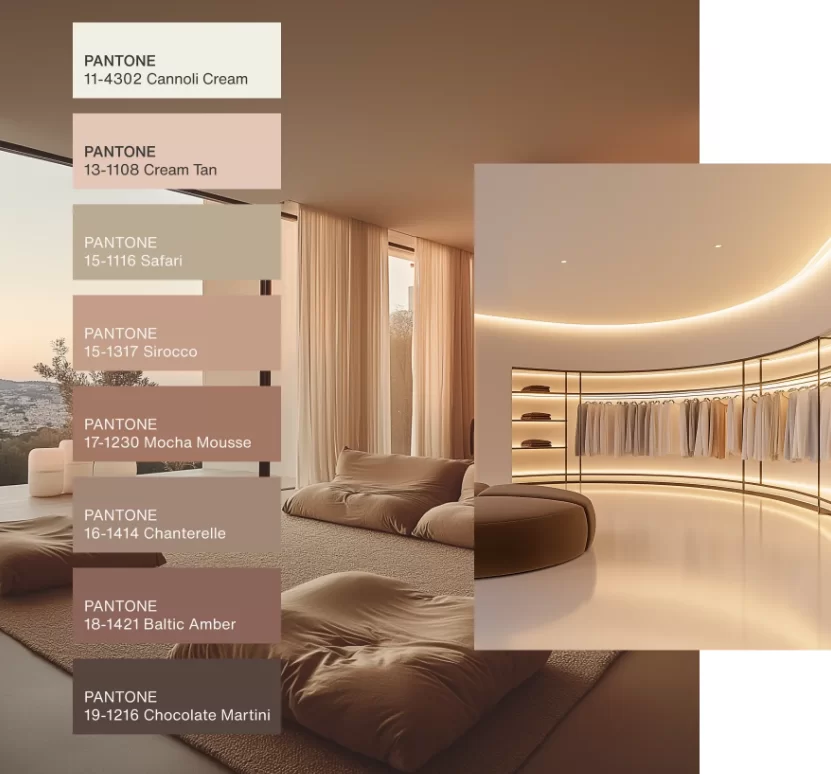
According to Home Accents Today, the Pantone 2025 Color of the Year — Mocha Mousse (17‑1230) — is described as a warm, earthy shade that reflects comfort and sophistication, aligning with broader design trends toward natural, grounded tones in interiors.
Over the past decade, many selected colors have been:
- Emotion-driven (comfort, calm, optimism)
- Subtle blends rather than primary tones
- Designed to create atmosphere, not just contrast
These types of colors often involve layered pigments and nuanced undertones. From a painting perspective, that means:
- Coverage may require more precision.
- Inconsistent pressure during rolling can create visible streaks.
- Poor-quality bristles can leave texture marks.
Understanding that these colors are psychologically driven also explains why brands care about accuracy. A slight shift in tone can change how a space feels. For commercial environments, that emotional impact matters.
2.2 Why B2B Clients Care About Color Trends
In B2B projects, color trends are rarely about personal preference. They are about positioning.
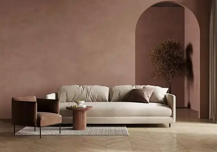
When a retail chain updates its color palette, it is usually part of a larger strategy — refreshing brand image, supporting a campaign, or aligning stores with a new design direction. Hospitality spaces use trend colors in a similar way. The goal is to shape atmosphere and influence how customers feel inside the space.
Because of this, color consistency becomes a business issue. If one location looks slightly off-tone or uneven compared to another, it affects brand perception. In large rollouts, even small differences can stand out.
This shift also changes buying priorities. Many distributors and contractors are no longer focused only on low-cost tools. They are paying more attention to finish control, consistency, and reducing the risk of rework.
As trend colors become more strategic, execution standards naturally rise.
3. The Real Challenge: Translating Trend Colors into Wall Paint
Moving from a trend forecast to a finished wall is where the real technical challenge begins.
3.1 Digital Swatches vs Real Paint Formulas
One of the most common misunderstandings I see is the assumption that a digital color reference equals a ready-to-use wall paint.
Pantone systems were originally developed as standardized color references, especially for print and product design. Translating those references into architectural coatings requires paint manufacturers to create matching formulas using specific pigments.
This process introduces variables:
- Base paint type (matte, satin, semi-gloss)
- Surface porosity
- Lighting conditions
- Application method
A color that appears smooth on a sample board may look darker or more uneven on a large wall surface. That is why experienced contractors always test under actual lighting before full application.
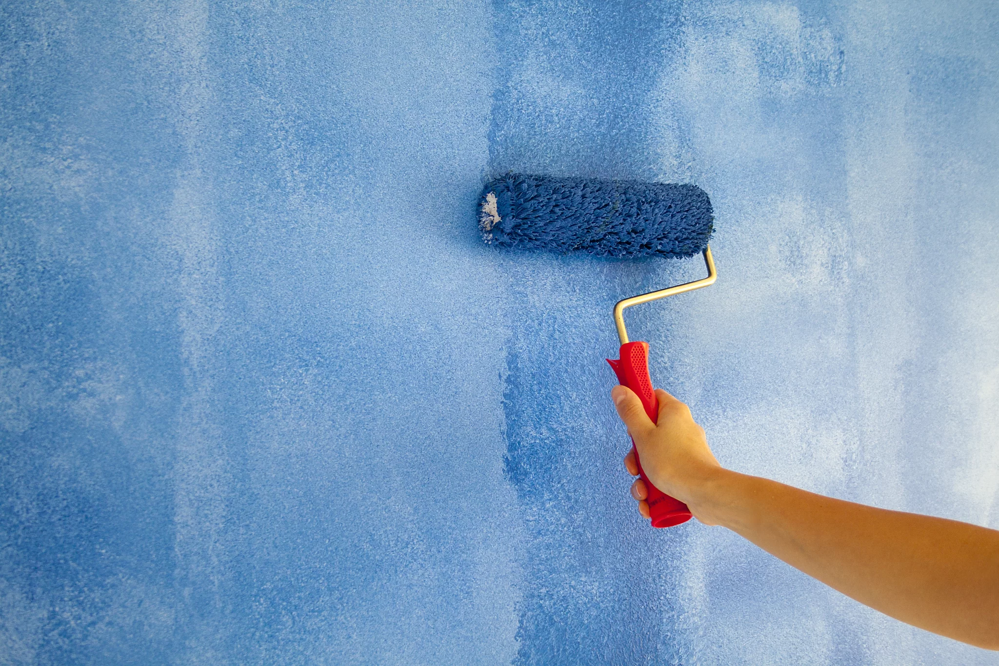
Trend colors, especially muted or earthy tones, can appear different depending on roller nap thickness and pressure. Tool choice directly affects how evenly pigment is distributed.
3.2 Deep & Muted Colors Expose Tool Quality
Trend colors are often deeper, softer, or more layered than traditional neutrals. These tones behave differently during application.
From what I’ve seen on job sites, the darker or more muted the shade, the less room there is for tool inconsistency.
Below is a simplified comparison based on real project observations:
| Color Type | Common Application Issue | Tool Sensitivity Level | Risk if Using Low-Grade Tools |
| Light Neutral | Minor roller marks | Low | Usually acceptable |
| Deep Saturated Color | Visible lap marks, uneven sheen | High | Strong visible streaks |
| Muted / Earth Tone | Patch visibility, texture inconsistency | High | Surface flaws amplified |
| Matte Finish | Sanding lines and edge marks show easily | Very High | Finish looks unprofessional |
This is why trend-driven projects often require higher consistency in brush shape, roller density, and surface preparation.
Deep colors do not forgive shortcuts.
4. Tool Selection Strategy for Trend-Based Projects
As trend colors become more complex, tool selection becomes more strategic. In standard white or light beige projects, small surface flaws may go unnoticed. But with deep, muted, or highly pigmented colors, every imperfection becomes visible.
From my experience working with contractors and distributors, projects that use trend-driven colors often succeed or fail based on preparation and tool quality — not just paint choice.
4.1 Surface Preparation Is No Longer Optional
Years ago, some contractors could move quickly through prep work, especially on repaint jobs. That approach does not work well with modern trend colors.
According to industry guidance from organizations like the Painting Contractors Association (PCA), proper surface preparation is one of the biggest factors affecting coating performance and appearance. Poor sanding, uneven patching, or dust contamination can lead to visible texture differences once darker or matte colors are applied.
Muted tones and matte finishes are especially unforgiving. They do not reflect light the way glossy surfaces do, so they highlight bumps, ridges, and joint lines.
In several retail refresh projects I’ve observed, skipping detailed sanding led to:
- Shadow lines along drywall seams
- Visible patch areas under directional lighting
- Uneven absorption in repaired spots
For trend-based projects, preparation should include:
✅️Thorough sanding of repaired areas
✅️Dust removal before priming
✅️Uniform primer application to control absorption
Surface prep may not be visible in the final design brief, but it directly impacts how trend colors appear in real space.
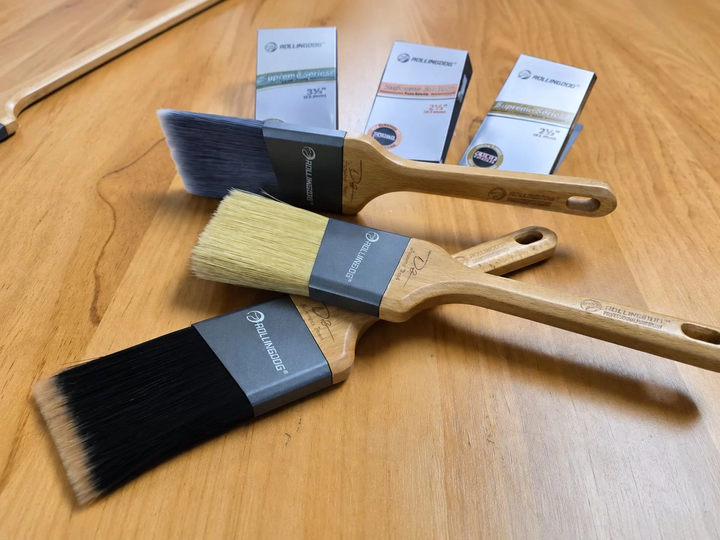
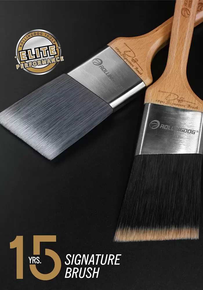
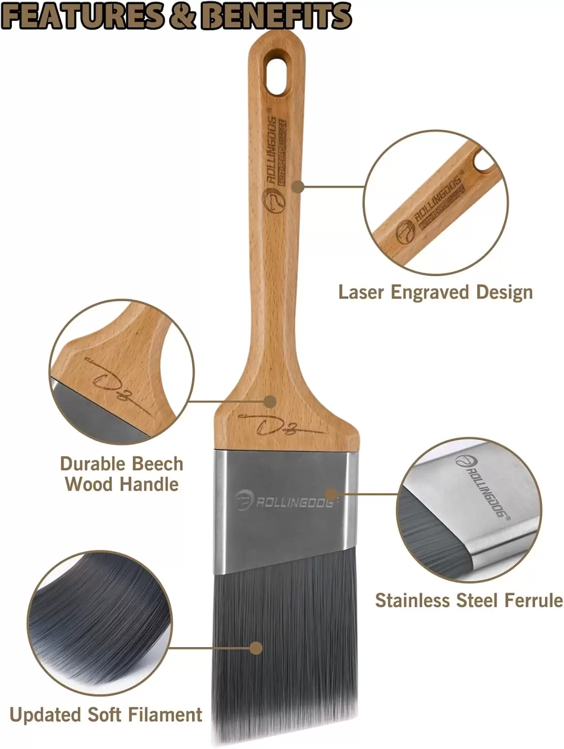
4.2 Choosing the Right Brush for Trend Colors
When applying modern interior colors, edge control and smooth leveling are critical.
Cutting-in around ceilings, trims, and fixtures is often where inconsistencies show first. Deep shades and complex undertones make brush marks more noticeable.
From a technical standpoint, higher-quality synthetic filament brushes tend to:
- Hold paint more evenly
- Release paint in a controlled manner
- Reduce visible streaking
For B2B contractors handling multiple locations, consistency is more important than speed alone. A brush that loses shape or leaves heavy stroke lines can increase touch-up work across dozens of stores.
In projects involving darker accent walls, I’ve seen low-quality brushes cause:
- Bristle marks that remain visible after drying
- Uneven edge lines under LED strip lighting
- Over-application in corners, leading to sheen differences
Professional buyers are increasingly aware that brush performance affects finish quality. The cost difference between standard and higher-grade brushes is small compared to the cost of rework.
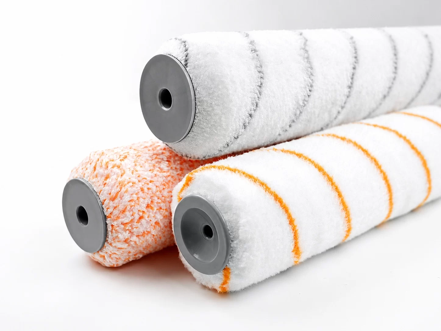
4.3 Roller Selection: Finish Quality Defines Perception
Roller selection often has the biggest impact on wall perception.
Instead of discussing theory, here’s a practical comparison:
| Roller Type | Typical Result | Risk Level on Trend Colors |
| Low-density economy cover | Uneven release, more splatter | High – lap marks visible |
| Medium-grade woven cover | Acceptable coverage | Moderate – depends on skill |
| High-density microfiber cover | Smooth leveling, uniform texture | Low – better control on deep shades |
Dark pigments and muted tones tend to exaggerate lap marks. Under LED retail lighting, those marks become more obvious.
The roller nap length determines how much paint is held and how it is distributed. For a detailed guide on selecting the right roller for your surface and finish goals, see ROLLINGDOG’s Nap Length Guide.
5. What I’ve Learned from Working with Global Buyers
Over the years, I’ve worked with buyers serving North America, Europe, and parts of Asia-Pacific. One common theme stands out: trend-driven projects are changing purchasing priorities.
5.1 Retail Projects Move Fast
Retail and franchise rollouts operate on tight timelines. When headquarters decides to update brand colors, hundreds of locations may need repainting within months.
This creates pressure in three areas:
- Tool availability
- Finish consistency
- Labor efficiency
If tools do not perform consistently, contractors may need additional coats or corrections. That increases labor cost and delays store openings.
In fast-paced retail environments, downtime equals lost revenue. Buyers are becoming more careful about the tools they approve for large-scale repainting programs.
5.2 Why Distributors Are Adjusting Their Tool Inventory
Distributors I’ve spoken with have noticed a gradual shift.
Instead of focusing only on entry-level brushes and rollers, many are expanding their mid- to high-performance lines. The reason is simple: clients want fewer finish problems.
Trend colors have raised the standard of expectations. End customers compare stores across regions. If one location shows visible streaking or uneven tone, it affects brand image.
Distributors also recognize that professional-grade tools can:
- Reduce complaints
- Improve contractor loyalty
- Offer better long-term margins
As trend cycles continue, inventory strategy is evolving from “lowest cost” to “best value for performance.”
6. Checklist: Preparing for a Trend-Driven Interior Project
Based on my experience, here is a practical checklist for contractors and buyers preparing for trend-based painting work:
Before Painting
- Confirm the approved color formula with the paint supplier
- Test sample panels under actual project lighting
- Inspect wall surface for imperfections
- Sand and clean all repaired areas
- Apply uniform primer where needed
Tool Selection
- Choose high-quality angle brushes for cutting-in
- Select appropriate roller nap for wall texture
- Use consistent roller pressure and overlap technique
- Replace worn roller covers during large projects
During Application
- Maintain consistent environmental conditions
- Allow proper drying time between coats
- Inspect finish under project lighting before sign-off
This checklist helps reduce the risk of uneven finish and costly rework.
7. Conclusion — Trend Creates Demand, Tools Deliver Results
Color trends start in design studios, but they succeed or fail on the job site.
As annual selections from organizations like Pantone continue to influence retail and commercial interiors, expectations for finish quality are rising.
From what I’ve observed, the difference between an average result and a premium finish often comes down to preparation and tool performance.
Trend creates demand.
Execution creates reputation.For contractors, distributors, and suppliers, investing in better tools is not about luxury. It is about controlling risk, protecting brand image, and delivering consistent results across projects.
In a market shaped by design trends, tools are no longer just accessories — they are part of the strategy.
Zoe Cen is a Marketing Specialist at ROLLINGDOG, a global leader in professional painting tools. She works on connecting the brand with international distributors and retailers, highlighting ROLLINGDOG’s innovation in brushes, rollers, and accessories. With a focus on global B2B marketing, Zoe helps partners access reliable, high-quality painting solutions for professionals and DIY users.